What we removed from our last three Shopify builds
There's one metric that never shows up in client briefs, and that says more than most about the actual value an agency brings. How many sections we removed from what the client wanted to build.
Almost every Shopify brief that lands on our desk arrives overloaded. That's normal, and it's not the client's fault. Anyone launching or rebuilding a store has spent months looking at competitors, gathering references, saving screenshots, and by the time they write the brief they want everything they've seen to find a place on their own site. Our job, before we build, is to decide what not to build.
Three recent examples, taken from the last three Shopify builds we shipped. The clients stay anonymous, the decisions are real.
The product configurator that shouldn't have existed
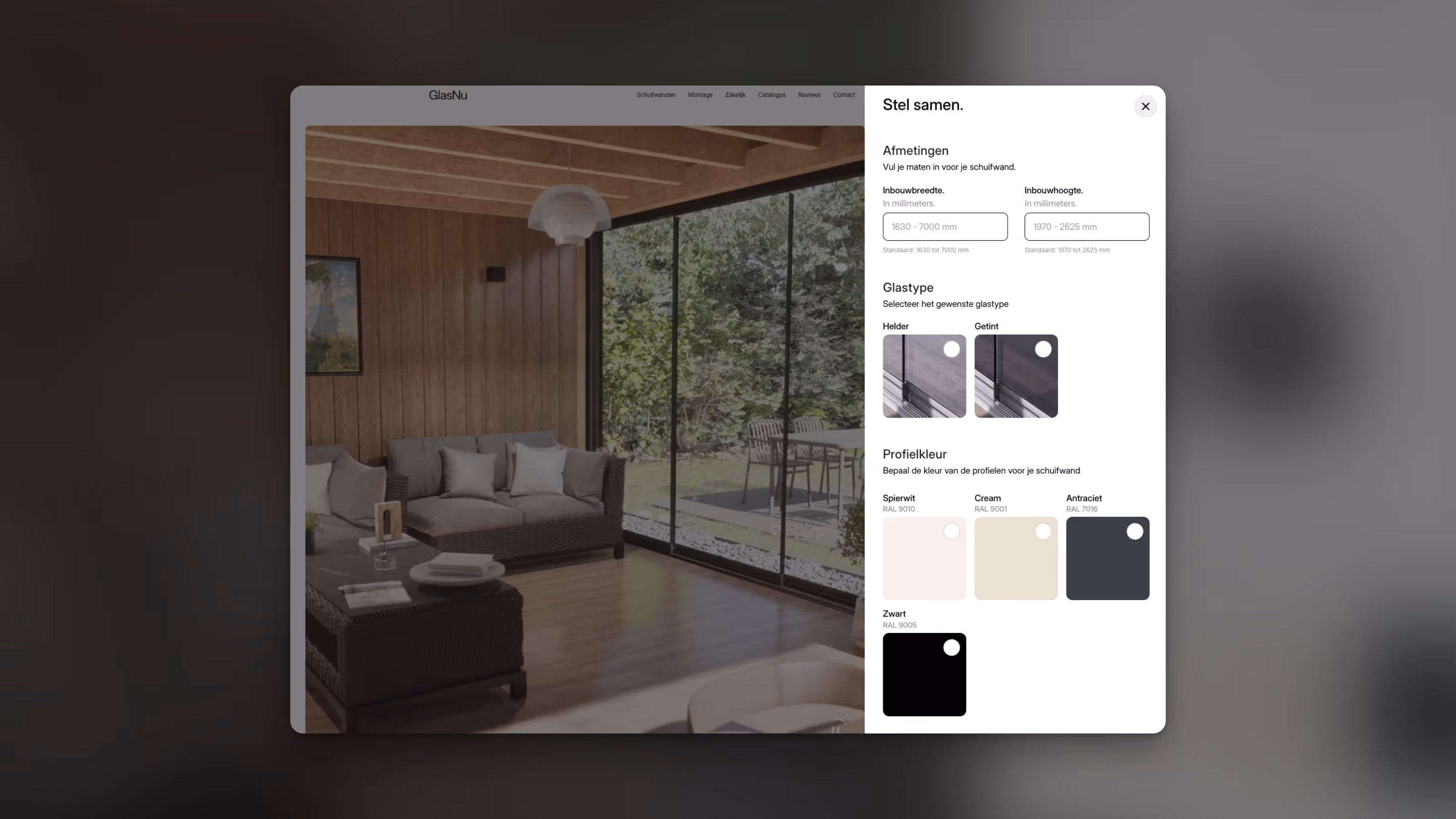
D2C brand in the furniture segment, average order value above one thousand euros, catalog of around forty SKUs. The brief asked for a product configurator on the homepage. The idea was that a visitor could compose their own product by choosing material, finish, and size, and get a tailored quote directly on the page.
The request came from an American competitor the client admired. On that competitor's site, the configurator works. For them.
What the client hadn't considered is that the competitor sells a single type of product declined into hundreds of variants, while their own catalog has forty products that are different from each other. A homepage configurator would have forced the visitor to pick a category, then a product, then variants. Four clicks before seeing anything concrete. The same thing Shopify product pages already do for free, natively, with a usability standard users already recognize.
We removed the configurator from the homepage. We brought it back only on two specific products, the ones that were actually customizable in their materials, as a self-contained module on the product page. The rest of the catalog kept standard Shopify variants. Development time saved on the initial build, around two weeks. Conversion rate measured in the first sixty days, in line with the category benchmark. The homepage configurator, had we built it, would have been an impressive portfolio piece and an operational liability for the client.
The blog the client wanted, with no one to write it
Skincare brand, new launch, founder with experience in the sector but no internal marketing team. The brief included a blog section with a full information architecture: categories, multiple authors, related posts, tag system, CMS ready to receive content.
On the first call we asked one question. Who writes.
The answer was that the founder would write herself, at least at the start, and that they were planning to publish one article a week. We asked how many articles they had ready at launch. Zero. We asked if they had an editorial calendar for the first three months. No. We asked if they had ever run a blog before. No.
The problem wasn't building the blog. That's a day and a half of work. The problem was that launching a skincare store with an empty blog section creates a precise kind of damage. The pages Google indexes have no content to index, the sitemap signals an area that never updates, and a visitor who clicks "Blog" in the menu lands on a placeholder. Three negative signals that weigh more than the positive signal of "having a blog".
We removed the Blog entry from the main menu and the footer. We left the CMS structure ready under the hood, so it could be turned on at any moment. We agreed it would come back online only when at least six articles were published and a plan was in place for the following six. Six months after launch, the blog is still offline. The store is converting above the target they set for themselves.
The "our values" page no visitor would ever open
Sustainable apparel brand, and this is the category where the request for a values page is almost automatic. The brief included a dedicated page covering manifesto, principles, production process, certifications, ethical partnerships. Six sections, long, with dedicated visual design.
We looked at the analytics of the client's previous site, which had a very similar page. Three percent of total traffic. Average time on page, twenty-two seconds. Bounce rate above eighty percent. The page wasn't being read. It was being opened by people who clicked the footer link, scrolled for three seconds, and closed it.
The reason is structural and it holds true for most "values" pages on sustainable brands. The visitor who cares about sustainability cares about it in an informed way. They want to know which fibers you use, where you stitch, which certifications you hold. They don't want to read a manifesto. They want to see facts, ideally on the product page, next to the price, while they are deciding whether to buy.
We removed the dedicated page. We took the six sections it was supposed to contain, kept two of them (material origin and certifications), and turned them into reusable components on the product page. The other four ended up, in a much shorter form, inside the About section. Result measured at three months: the materials section on the product page is one of the three most clicked elements before "add to cart", and it shows up clearly in Hotjar session replays.
The principle behind the three decisions
None of what we removed was a bad idea in the abstract. A product configurator, a blog, a values page are all elements that work very well in other contexts. What the three decisions share is the way they were made.
We looked at what the client wanted. We looked at what the user would actually do. We looked at what the client could realistically maintain over time. When those three vectors didn't line up, we proposed removing.
Removing is the hard part of an agency's job, because it requires telling the client that something they want isn't going to serve them, and explaining why. It's easier to build everything the brief asks for, send the invoice, and move on to the next project. Easier, and it produces sites that convert worse.
When a client asks why our first proposal contains fewer sections than their initial brief, the answer is always the same. Because every section that makes it into the build has to justify its existence in three ways: it serves the user, it supports a business metric, and the client can sustain it over time. Sections that don't pass these three filters shouldn't be built more carefully. They should be removed.
See how we work with our clients.


.avif)

.avif)

.avif)